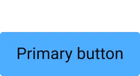
Anatomy
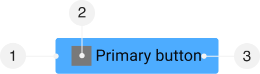
- Container
- Left icon (optional) (optional)
- Label
Default Values
| Attribute | Token | Value |
|---|---|---|
| Container | ||
| Padding (Left and Right) | button-padding-x-medium | |
| Padding (Top and Bottom) | button-padding-y-medium | |
| Border Width | button-border-width | |
| Border Radius | button-radius | |
| Border Color | button-color-border-primary-default | |
| Background Color | button-color-background-primary-default | |
| Label | ||
| Font Family | font-control-body-1-font-family | |
| Font Size | font-control-body-1-font-size | |
| Font Weight | font-control-body-1-font-weight | |
| Line Height | font-control-body-1-line-height | |
| Letter Spacing | font-control-body-1-letter-spacing | |
| Text Color | button-color-text-primary | |
| Left icon (optional) | ||
| Dimension | button-icon-dimension | |
| Margin (Right) | button-icon-margin-right | |
| Fill Color | button-icon-color-fill-primary |
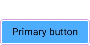
Kinds
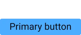
Primary
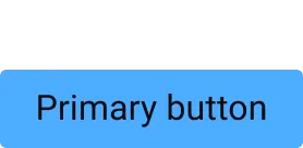
Default
| Attribute | Token | Value |
|---|---|---|
| Container | ||
| Background Color | button-color-background-primary-default | |
| Border Color | button-color-border-primary-default | |
| Label | ||
| Text Color | button-color-text-primary | |
| Left icon (optional) | ||
| Fill Color | button-icon-color-fill-primary |
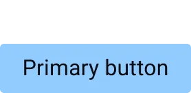
Hover
| Attribute | Token | Value |
|---|---|---|
| Container | ||
| Background Color | button-color-background-primary-hover | |
| Border Color | button-color-border-primary-hover |
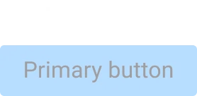
Disabled
| Attribute | Token | Value |
|---|---|---|
| Container | ||
| Opacity | opacity-disabled |
Secondary
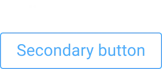
Default
| Attribute | Token | Value |
|---|---|---|
| Container | ||
| Background Color | button-color-background-secondary | |
| Border Color | button-color-border-secondary-default | |
| Label | ||
| Text Color | button-color-text-secondary-default | |
| Left icon (optional) | ||
| Fill Color | button-icon-color-fill-secondary-default |
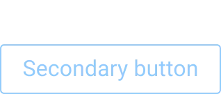
Hover
| Attribute | Token | Value |
|---|---|---|
| Container | ||
| Background Color | button-color-background-secondary | |
| Border Color | button-color-border-secondary-hover | |
| Label | ||
| Text Color | button-color-text-secondary-hover | |
| Left icon (optional) | ||
| Fill Color | button-icon-color-fill-secondary-hover |
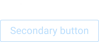
Disabled
| Attribute | Token | Value |
|---|---|---|
| Container | ||
| Opacity | opacity-disabled |
Borderless


Default
| Attribute | Token | Value |
|---|---|---|
| Container | ||
| Background Color | button-color-background-borderless | |
| Border Color | button-color-border-borderless | |
| Label | ||
| Text Color | button-color-text-borderless-default | |
| Left icon (optional) | ||
| Fill Color | button-icon-color-fill-borderless-default |
Hover
| Attribute | Token | Value |
|---|---|---|
| Label | ||
| Text Color | button-color-text-borderless-hover | |
| Left icon (optional) | ||
| Fill Color | button-icon-color-fill-borderless-hover |
Disabled
| Attribute | Token | Value |
|---|---|---|
| Container | ||
| Opacity | opacity-disabled |
Sizes
Small
| Attribute | Token | Value |
|---|---|---|
| Container | ||
| Padding (Left and Right) | button-padding-x-small | |
| Padding (Top and Bottom) | button-padding-y-small |
Medium
| Attribute | Token | Value |
|---|---|---|
| Container | ||
| Padding (Left and Right) | button-padding-x-medium | |
| Padding (Top and Bottom) | button-padding-y-medium |
Large
| Attribute | Token | Value |
|---|---|---|
| Container | ||
| Padding (Left and Right) | button-padding-x-large | |
| Padding (Top and Bottom) | button-padding-y-large |
Icon Only
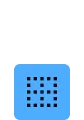
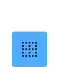
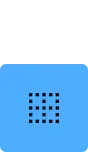
Small
| Attribute | Token | Value |
|---|---|---|
| Container | ||
| Padding (Left and Right) | button-padding-x-small-icon-only | |
| Padding (Top and Bottom) | button-padding-y-small-icon-only |
Medium
| Attribute | Token | Value |
|---|---|---|
| Container | ||
| Padding (Left and Right) | button-padding-x-medium-icon-only | |
| Padding (Top and Bottom) | button-padding-y-medium-icon-only |
Large
| Attribute | Token | Value |
|---|---|---|
| Container | ||
| Padding (Left and Right) | button-padding-x-large-icon-only | |
| Padding (Top and Bottom) | button-padding-y-large-icon-only |
Focus
| Attribute | Token | Value |
|---|---|---|
| Container | ||
| Outline Offset | spacing-focus-default | |
| Outline | color-border-focus-default |