Interactive Example
Rules of Thumb
- Use Segmented Buttons:
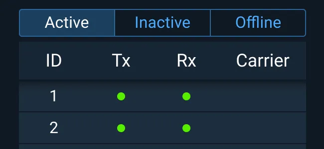
- To filter a Grid or Table.
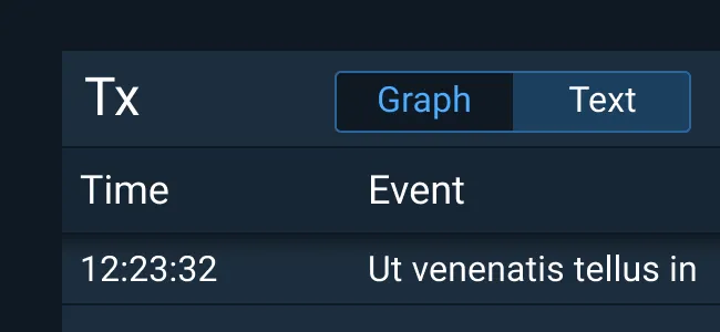
- To switch a view’s display mode.
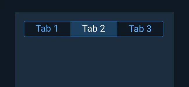
- One option must always be selected.
Appearance and Behavior
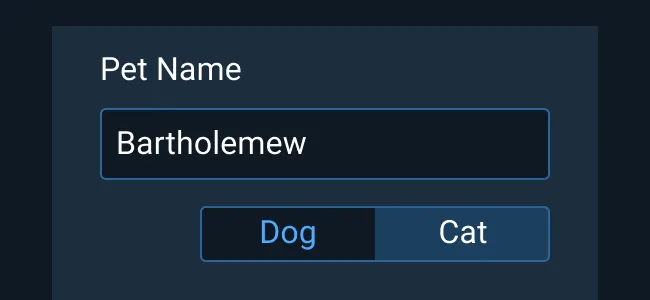
To learn more about adding Help Text to Segmented Buttons, see the Forms and Validation guidance.
Examples


Asset Status
| Asset | Version | Status |
|---|---|---|
| Documentation | N/A | Available |
| UI Kit - Dark | v7 | Available |
| UI Kit - Light | v7 | Available |
| UI Kit - Wireframe | v7 | Available |
| Web Component | v7 | Available |
| Component Tokens | N/A | Planned |
Status Key
AvailableIn ProgressPlannedNot AvailableDeprecated